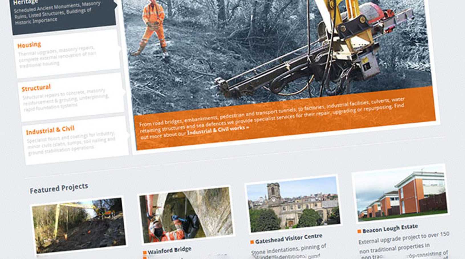
I’m very excited to announce that our new website is now ‘officially’ live after a long, long gestation period. We’ve been working really hard behind the scenes to ensure that our new site provides visitors with a far better user experience. To achieve this, the structure of the site has been greatly revised.
You’ll notice that our Services are now located in the primary navigation at the top of each page alongside our new Expertise section where you’ll find a selection of new, long form case studies for download.
We’ve made our Projects section easier to navigate and given more space to site photography on individual schemes so that our work can speak for itself. New featured projects will be added each month from this point onwards.
Elsewhere, we’ve simplified our About section, tidied up the Blog and added a smattering of social media here and there too. Also, we’re re-launching our email newsletter which you can subscribe to at the bottom of this post. The result of the changes so far is a much more streamlined website which is far easier to get around.
Moving with the Times
From the outset, we made the decision to build the site using the latest web technology, namely HTML5 and CSS3. We’ve adopted HTML5 due to its accessibility, mobile browser support and also for native video and audio playback which will come in handy when adding video footage to our site later in the year. It also means that Ranson will no doubt be looking to promote his band’s music at every opportunity – you have been warned!
All this future-proofing comes at a price: we’re dropping support for Internet Explorer 6 – Microsoft’s legacy browser – which is 12 years old this year. As IE6 accounts for less than 2% of our website traffic, and with the percentage steadily dropping over time, we took the decision to invest development time elsewhere to bring the majority of users a better experience. However, we still support IE7, IE8 and IE9 onwards.
Device Agnostic
With the proliferation of smart phones, tablets and other internet enabled devices both at home and in the workplace, we’ve adopted Responsive Design to create a flexible layout that changes the presentation of information depending upon the user’s screen size. The result is content that’s easier to consume, interact with and link to whether you’re using an iPad, iPhone or traditional computer.
As we’ve just launched, you may come across the occasional bug as you use the new website. Should this be the case then we’d appreciate it if you could drop us an . Alternatively, if you’d prefer to offer some general feedback on the new site, we’d be most grateful if you could use our contact form to tell us what you think.
In the interim, we have a lot of great things planned for the new site including: video content; a new commenting system so that you can more easily share your thoughts and opinions; and a dedicated Downloads section for case studies and technical documents.

